UPDATE August 13, 2014: They’re mucking up the Chicago Tribune now, as well. I am on the case.

I admit it–I read the Los Angeles Times with some regularity. The recent redesign of latimes.com has much to recommend it (especially given the annoyances of the previous version) and plenty for people to complain about. I’m not really interested in pronouncing an overall verdict. It’s here and it’s not going away.
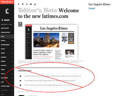
However, I am interested in not dealing with one of the new design’s features in particular: the “sharelines.” These are presented as a choice of canned headlines that a reader can click to instantly post the story to Twitter or Facebook. It’s not a new concept, really, but a few aspects of the sharelines get in my craw:
- They take up an inordinate amount of vertical space and often put the beginning of the story below the fold. It’s only two or three sentences, but the design treatment of sharelines make them obtrusive and keep me from getting to the story I want to read.
- And speaking of that placement, why the hell are they located before the story? How am I supposed to know that I want to share the story before I’ve even read it? How can I know which aspects of it I want to call out when I haven’t read any of those aspects? This is signaling to me that the story isn’t even necessary, and that my reading the story isn’t necessary–that I can get what I need to know from the sharelines and perform my function of putting it on social media without ever referring to the actual text.
- This may just be me talking, but I feel pretty damn condescended to when a website wants to write my tweet for me. It’s like the Times is reaching over the table and cutting my steak into little pieces.
In the scheme of things, it’s a tiny Internet annoyance, yet it offended me enough that I did something about it. And in case you for some reason share the desire to disappear these little barnacles of social media desperation, I’m here to tell you how I did it.
Steps
- Install, if you have not, the Stylish extension for Firefox or Chrome. This allows you to apply custom styles to specified web pages, much like Greasemonkey lets you apply custom code to the pages you visit.
- Go to the Turn off LA Times “sharelines” page on userstyles.org, which is the common repository for styles written for the Stylish extension. Click the “+ Install with Stylish” button and acquiesce to whatever it asks.
That’s all.
What it does
There isn’t much to this (which is why I felt like I could handle it). You can view the CSS code on the install page. Most of it is there to tell Stylish where to apply the style (any pages in the latimes.com domain), and the line div.trb_sharelines { display:none; } just tells the browser to blank out the parts of the page that it would otherwise style as sharelines.
More styles
It’s worth a trip through userstyles.org to see if anyone has posted tweaks to sites you regularly visit.
If you’re interested in writing your own styles, I would use this tutorial and, if you’re curious, read up on the rules of which sites styles get applied to. Then, if you’re feeling generous, as I am today, here’s how to share your style on userstyles.org.
