Sharelines metastasize, now plague Chicago Tribune

Trib sharelines: these stinkSharelines, the dopey white flag the LA Times waved to twitchy social media culture earlier this year, have made their way to the Tribune mothership in a recent Chicago Tribune redesign.

I loathe these things because they get in the way of my reading, but I despise them because the news sites are putting them above the story and, in effect, saying share without reading. That’s disrespectful to readers, and it’s disrespectful to their very product (assuming you naïvely believe as I do that all those words in the story are the actual product).

So to welcome fucking sharelines to the Tribune, I’ve added a couple of sibling userstyles to the Turn off LA Times “sharelines” style that makes them disappear from the page. You can now also choose:

Instructions for installing the styles and the Stylish extension are in the previous post. Feel free to share!

Robin Williams, Frank O’Hara, and brand-name specificity in mourning

Every time a notable death hits me hard, I end up thinking about Frank O’Hara’s “The Day Lady Died,” his elegy for Billie Holliday.

Thinking about it today, after Robin Williams’s death, makes it seem a very strange poem, and a kind of amazing contrast to the way we lived with and reacted to the news about Williams.

The speaker of “The Day Lady Died” spends most of his lines limning his lunchtime errands with notable checking of names and brands, a lot of them even more notable for being set in small caps. To me, this feels like an intoxicating consumer fantasy of a life in the arts in 1950s Manhattan: to spend one’s (considerable) money on lunch, books, booze, and smokes while looking forward to dinner with friends and strangers. It descends into what seems like parody as he considers buying “Hesiod, trans. Richmond Lattimore” and other things blatantly boho and blatantly phrased with pretention, like “Les Nègres / of Genet.”

I’m probably reading incorrectly or offensively how much names and brands, and the purchasing of names and brands, serve to make the speaker seem like a grotesque of the postwar cultured New Yorker, but the catalog of things he buys and considers buying make this part of the poem seem like it comes from a lifestyle magazine, from a slightly Atlanticized riff on “What Sort of Man Reads Playboy?” It feels much more like the kept life of George Peppard in Breakfast at Tiffany’s than an actual life. It is absolutely captivating.

And it is on top of this Midtown fantasy of everyday boho life that the inescapable oppression of Holliday’s death sits. When the speaker finally acknowledges the subject of the poem, finally breaks the tension the reader has felt waiting for the part about the dead person, It feels as if the title itself has been applying the unacknowledged weight to the lines below it. It becomes clear as the speaker “casually ask”s for cigarettes and, oh yeah, a newspaper carrying the reality and finality of what has happened, that all the purchasing and futzing about which status-signaling literature to purchase has been in the service of avoiding this moment.

Seen against the absence of Holliday’s name—even in the title, her sobriquet “Lady Day” is hidden in reversal, and in the text she is only “she” and “her”—the focus on proper nouns and brands can be seen as a welcome distraction. Consumerism is being used to avoid the ache of loss and terror of death. But the devastation of the memory of her at poem’s end suffuses everything, makes names—and the power man thinks he wields with his naming—puny.

In contrast:

williams-trending

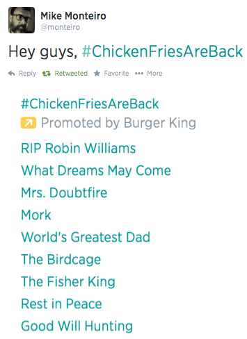
Here’s a screen capture of trending topics tweeted by Mike Monteiro about an hour after the news about Williams broke wide. And it’s the polar opposite of the poem: One brand name and like a dozen references to the deceased.

Here, the presence of an unrelated corporate brand is presented and understood as a sick joke. There is no comfort in Chicken Fries, there is only the friction created by pre-programmed content trying to horn in on the discussion of the day and the recognition of its absurdity. Rather than drowning our mourning selves in consumerism, there’s a recognition that only a contextual consumerism is appropriate (my roommates right now are watching The Birdcage) and that it forms only part of our response.

The brand names that we on social media distracted ourselves with were no distraction at all—they were “Robin Williams” and the names of his works. I don’t think anyone will disagree that we all felt the magnitude of the event, and that we or people we know are as moved by the death of Williams as the poem’s speaker was by that of Holliday. But clearly we have vastly different ways of coping with loss than our poor speaker does.

O’Hara’s speaker attempts to note—in proper-noun specifics down to the proximity of the nearest holiday—the details of a day that have names attached to them and can be taken as a (fantasy) version of normality. He attempts to locate himself in this specific name-branded day to avoid engulfing, timeless loss.

On the internet, though, we brought together immediate feelings, memories of Williams and his work, and clips from throughout his career. We located—or lost—ourselves in a kind of timeless, borderless soup of recognitions of his absence and recreations of his presence. It’s hard not to think of this as the healthier of the two responses.

It’s also hard—even if we stay away from cultural criticism—not to pick up on echoes of menace and the death instinct in “The Day Lady Died” that O’Hara probably didn’t intend. His speaker is buying four hundred cigarettes for the weekend, for Christ’s sake (probably for two people, sure, but still, damn). His version of normality is already soaked in death even on days when Billie Holliday has not died.

And I am sure similar accusations can be leveled at us as we stare at screens in our coping. In that spirit, here is footage of Frank O’Hara reading “The Day Lady Died” and I want you to watch it with the knowledge in mind that (as is stated earlier in the video) this performance was filmed just weeks before O’Hara’s own death from an auto accident.
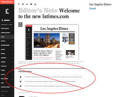
Faster printing to PDF in OS X

  1. The job
  2. Faster printing to PDF in OS X

I didn’t mean to set down immediately to publishing tips from the field, but this one is so basic and addresses so much petty annoyance.

Of the several ways to document internet research, the most common command I issue every day is Print to PDF, and every time I issue it, the process maddens me with its inefficiency.

save-to-pdf-dialogOn a good day I’ll document 150 sources, which means 150 instances of hitting Command-P to bring up the print dialog, 150 times I have to move a hand to the mouse to bring up the PDF menu in that dialog, and 150 times I move it back to save.

But MacSparky has instructions for creating a universal keyboard shortcut for Save to PDF. It feels a tad hacky because you map it to Command-P and then to make it work you hit Command-P twice in a row, but it eliminates the interruption of needing to mouse, and I will take it. Oh yes I will take it.

Because the keyboard shortcut is entered for All Applications, this works with any browser and, indeed, any application that prints.

This magical secret has been available for the finding for years. It is my great failure never to have looked it up before.

The job

  1. The job
  2. Faster printing to PDF in OS X

I’m a game show researcher. I was going to take as my topic “television research,” and then in the course of researching that, I found this job description for television researchers and it frightened me. It makes it sound like being a researcher means getting seriously underpaid while also performing three-quarters of the tasks of pre-production:

  • producing and development (“originate or develop program ideas”)
  • writing (“writing drafts, or briefing others who write”)
  • casting (“assess contributors’ potential suitability … and arrange for their appearance”)
  • location (“assess locations for suitability and cost”)
  • clearance (“identify, negotiate fees for, and conclude copyright clearances and legal issues”)
  • publicity (“prepare production materials for external use”)

Pictured: Not Me

Pictured: Not Me

… all under the seriously far below-the-line credit of “researcher.”1 Under this definition, Al Pacino in The Insider—he of the negotiating with terrorists, facing down Big Tobacco, and being the only conscience of all CBS News—was but a researcher.

For the time being in this series, I’ll leave all those items in the official description to Pacino.

Because the job as I (thankfully) know it also has many facets, but they mostly reflect the pleasant task of making sure that what is presented to you on TV as true is, in fact, true.

Or, as I like to think of it, making sure we don’t look as stupid as the original Trivial Pursuit people did with all their partial, debatable, and flat-out wrong answers.

That task is what makes it fun and meaningful. That task is my jumping-off point. It’s true that plenty of Pacino’s duties can intrude on it, but that task is what the job is to me.


  1. And this is completely separate from the “audience research“ done by marketing departments. I have a feeling those people get paid. 

Hiding latimes.com “sharelines” with the Stylish extension

UPDATE August 13, 2014: They’re mucking up the Chicago Tribune now, as well. I am on the case.

no_sharelines

I admit it–I read the Los Angeles Times with some regularity. The recent redesign of latimes.com has much to recommend it (especially given the annoyances of the previous version) and plenty for people to complain about. I’m not really interested in pronouncing an overall verdict. It’s here and it’s not going away.

However, I am interested in not dealing with one of the new design’s features in particular: the “sharelines.” These are presented as a choice of canned headlines that a reader can click to instantly post the story to Twitter or Facebook. It’s not a new concept, really, but a few aspects of the sharelines get in my craw:

  • They take up an inordinate amount of vertical space and often put the beginning of the story below the fold. It’s only two or three sentences, but the design treatment of sharelines make them obtrusive and keep me from getting to the story I want to read.
  • And speaking of that placement, why the hell are they located before the story? How am I supposed to know that I want to share the story before I’ve even read it? How can I know which aspects of it I want to call out when I haven’t read any of those aspects? This is signaling to me that the story isn’t even necessary, and that my reading the story isn’t necessary–that I can get what I need to know from the sharelines and perform my function of putting it on social media without ever referring to the actual text.
  • This may just be me talking, but I feel pretty damn condescended to when a website wants to write my tweet for me. It’s like the Times is reaching over the table and cutting my steak into little pieces.

In the scheme of things, it’s a tiny Internet annoyance, yet it offended me enough that I did something about it. And in case you for some reason share the desire to disappear these little barnacles of social media desperation, I’m here to tell you how I did it.

Steps

  1. Install, if you have not, the Stylish extension for Firefox or Chrome. This allows you to apply custom styles to specified web pages, much like Greasemonkey lets you apply custom code to the pages you visit.
  2. Go to the Turn off LA Times “sharelines” page on userstyles.org, which is the common repository for styles written for the Stylish extension. Click the “+ Install with Stylish” button and acquiesce to whatever it asks.

That’s all.

What it does

There isn’t much to this (which is why I felt like I could handle it). You can view the CSS code on the install page. Most of it is there to tell Stylish where to apply the style (any pages in the latimes.com domain), and the line div.trb_sharelines { display:none; } just tells the browser to blank out the parts of the page that it would otherwise style as sharelines.

More styles

It’s worth a trip through userstyles.org to see if anyone has posted tweaks to sites you regularly visit.

If you’re interested in writing your own styles, I would use this tutorial and, if you’re curious, read up on the rules of which sites styles get applied to. Then, if you’re feeling generous, as I am today, here’s how to share your style on userstyles.org.

Invocation

As new endeavors should be marked with a bit of ceremony, but shouldn’t roll eyeballs, I’m opening this place up with a poem, but not a painfully earnest and hopeful one.

Gerard Manley Hopkins’s “The Alchemist in the City” is as much about ambivalence as ambition–to my admittedly uninformed ear, anyway–and seems (thus) to capture a bit of the experience of Los Angeles. It’s about inaction and awe and failure, but also about the seemingly instinctual stance we take against them (yes, yes, while also contemplating giving in and and dying–like I said, ambivalent).

The Alchemist in the City

by Gerard Manley Hopkins

My window shews the travelling clouds,
Leaves spent, new seasons, alter’d sky,
The making and the melting crowds:
The whole world passes; I stand by.

They do not waste their meted hours,
But men and masters plan and build:
I see the crowning of their towers,
And happy promises fulfill’d.

And I – perhaps if my intent
Could count on prediluvian age,
The labours I should then have spent
Might so attain their heritage,

But now before the pot can glow
With not to be discover’d gold,
At length the bellows shall not blow,
The furnace shall at last be cold.

Yet it is now too late to heal
The incapable and cumbrous shame
Which makes me when with men I deal
More powerless than the blind or lame.

No, I should love the city less
Even than this my thankless lore;
But I desire the wilderness
Or weeded landslips of the shore.

I walk my breezy belvedere
To watch the low or levant sun,
I see the city pigeons veer,
I mark the tower swallows run

Between the tower-top and the ground
Below me in the bearing air;
Then find in the horizon-round
One spot and hunger to be there.

And then I hate the most that lore
That holds no promise of success;
Then sweetest seems the houseless shore,
Then free and kind the wilderness,

Or ancient mounds that cover bones,
Or rocks where rockdoves do repair
And trees of terebinth and stones
And silence and a gulf of air.

There on a long and squared height
After the sunset I would lie,
And pierce the yellow waxen light
With free long looking, ere I die.